Let’s take a few minutes and compare the differences between the current Ingredient List format, and the upcoming revised version.
Currently, you’re allowed to have dark font ingredients on a light background or even light font ingredients on a dark background. The contrast should make the ingredients easy to read. Anything hard to read will not adhere to Canadian regulations.
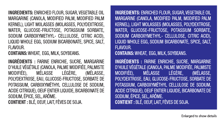
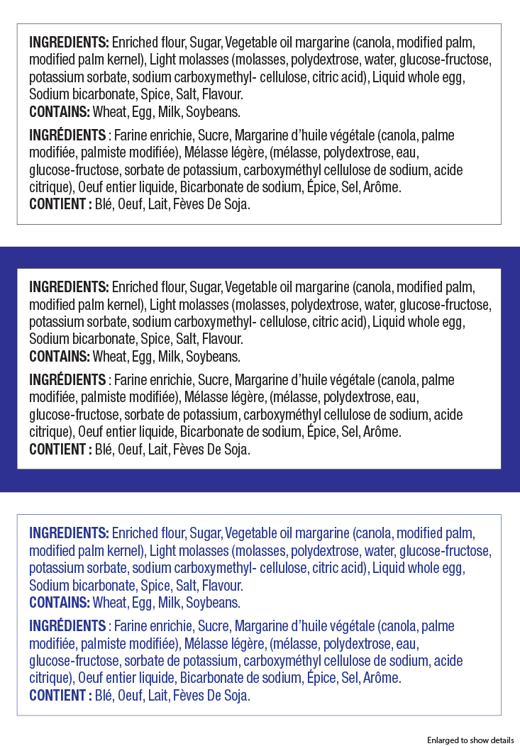
With the new format, your ingredients have to be printed on a white background, and be surrounded by a stroke. The ideal colour is black on white. The white box needs to be present even if that specific panel has a background colour. If your label isn’t printed with black ink, you’re allowed to have your ingredients and stroke printed in another dark colour.
Please read this post it learn a bit more about font sizes Canadian Ingredients – Font Sizes
Disclaimer: Packaging layout and information should be reviewed by an expert to ensure all regulations are taken into account. Certain rules apply to specific products and some of the rules are based on the size of your printable area or principal display panel (PDP).